
User Interface Design Principles for Web Applications
Three years ago, I wrote up a blog post regarding the design decisions I took when designing and developing the user interface for a Rich Internet Application for enterprise SMS messaging. At the time, I documented what I called "emerging usability design patterns." Today, I was writing the Flex Quick Start tutorial for Validators when I realized that everything I was writing there about usable validation hadn't changed since my original blog post. Reading my post again, I further realized that all of the other points were still valid and had been validated in the projects I had undertaken since the one that prompted the original post. As such, I decided to revisit the article and expand upon it.
I hope you will find it to be a useful resource.
About the project that prompted the design principles
I was hired by a company called Telrock who had a design brief for an SMS messaging Rich Internet Application (codename, Opal) which they wanted to be "Outlook for SMS". The brief stated that the application should look and behave like Outlook in every way. This was, of course, a reflection of Opal's target audience: enterprise users already familiar with using Outlook for their email.
I could understand the business need behind wanting to emulate it Outlook, but I was worried that Outlook's multi-pane interface was overly complicated for the modest requirements of SMS. Email and SMS are very different media. Emails can run into the thousands of words and contain complex attachments whereas SMS messages are limited to 160 characters.
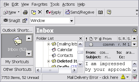 Outlook: powerful but complicated
We also had strict limits on screen real-estate: Opal had to be usable on 800x600 screens and scale intelligently (like a desktop application) when resized. I knew that there would be several factors that would affect the usability of the whole application and raised these with my client.
This brings me to the first principle which has both nothing to do with the design itself and yet everything to do with the process that will ultimately determine the design:
User Interface Design Principles
The client may think she knows what the user wants, but she cannot. This is because the client is not the user.
This brings me to the second principle:
2. Don't Give The Client What She Thinks The User Wants
If the client does not know what the user wants and you give her what she is asking for, you are doing her a disservice. You will ultimately be delivering an application that does not meet user's needs. Your client may initially be happy that you have given her exactly what she asked for but will she remain happy when the product is rejected by users?
I have seen too many designers and developers who are aware of these two principles but proceed to reach the wrong conclusion from it. Namely, that they know the user better. Which brings us to our next principle, which is, simply:
3. You Do Not Know What Your User Wants
You may be a user interface designer or developer with many years of experience but you do not know what users want. Which users? Those specific users who will be using the current application that you are building. Why? Because every application is unique. You may have built similar applications but, unless you have built exactly this application before, you do not know what the users of this application want.
So, who does know what your users want?
4. Only Users Know What Users Want
It's a basic concept but one that is alien to much of our industry. Only users of your application will know what works and what doesn't. It's surreal that, given this, most of us in our industry go out of our ways to delay asking them what they think of our applications. This brings me to the most imporant principle of all:
5. Test Early, Test Often, Then Test Again
Usability testing is not rocket science. In fact, it's quite a simple recipe:
Ingredients:
- Two rooms
- One or more representative users
- A computer running your application
- A usability tester
- A video camera (no tape)
- A TV screen
Take two rooms and place a computer running your application in one of them. In that room, place a representative user and a usability tester who will ask the user to perform various tasks in your application. Place a camera in the room to relay your user's actions to your design/development team who should be watching from the second room. (Ideally, having the rooms next to each other means that you don't have to run too much cable between the two but you can just as easily use wireless technologies or even broadcast the feed over the Internet to a development team across the globe.)
Leave to simmer then repeat.
Notice that you do not even need to record the test. If you do, chances are those tapes will become paperweights like most artifacts that are created during development. Remember: Agile is good.
Doing usability testing does not involve a large upfront financial investment. You can put together the above setup for around $1,000 these days. What it does involve, however, is buy-in to a User-Centered Product Development (UCPD) approach from the highest levels at both your and your client's organization.
Following a UCPD approach involves capturing measureable Usability Requirements alongside your Functional Requirements. You will have to set aside time to carry out usability testing at every iteration in your development process. You cannot do this without a budget. And you won't have a budget unless you have buy-in at the highest levels.
The above principles are perhaps the most important ones as they will determine your development process and your development process will largely decide whether your project succeeds (is accepted by your users) or fails (is rejected by your users.)
Alongside these process-related principles are design principles. These do not, in any way, replace testing. They are intended to give you a good starting point when designing your user interface, before you go to your users and say, "What do you think?"
There should only ever be a single term or phrase used to refer to any given item in the application. An item here may refer to a concept, a business function or task or even a widget or individual interface element. You will find that the use of a metaphor for the project, as advocated by eXtreme Programming (XP), will ease this task tremendously.
Try to limit the user's physical toil while using the application. Repetitive Strain Injuries (RSI) are a fact of life today and we, as application designers, have to accept responsibility for the ergonomics of our applications.
It is your job as the user interface designer to layer the user interface and make important decisions about its organization. Don't leave these decisions to the user just because it makes your life easier. If your application has a huge preferences section, treat this as a Design Smell and review the design to see if you have left decisions that you can make to the user.
Users must be able to perform their most frequent, most important tasks without any resistance. For an SMS Messaging application, for example, this would include reading, replying to and forwarding messages and quickly checking the various mailboxes.
Whenever possible the UI should prevent the user from making a mistake instead of alerting the user to the mistake after the fact. This must be achieved without the UI getting in the way of the user.
The UI should give the user sufficient feedback for user actions. (This ties in nicely with Steve Krugs "Don't Make Me Think" philosophy: The user should never have to think "did that work?") Related to Don't Lose The User.
Although this may seem to contradict the Give Sufficient Feedback principle, it is actually meant to compliment it. Whenever possible, meaningful visual cues (when appropriate to the audience) should be chosen instead of lengthy textual descriptions. This can also pertain to actually teaching a user to do something in an application by showing them.
The UI should protect the user's sense of spatial positioning. The user should never feel "lost" within the application.
14. Don't Sell What You Can't Deliver
Users must not be given Graphical User Interface (GUI) expectations that cannot be met (or can only be partially met) within a Web User Interface (WUI). Whenever OS or GUI expectations are set, they must be fully met. That said, the application must try and meet OS expectations as much as possible, especially for ergonomic features such as keyboard shortcuts and navigation but also for expected auxiliary helpers such as tooltips.
Don't Sell What You Can't Deliver is the main principle behind why Adobe chose to create a new component style called Halo in Flash and Flex instead of trying unsuccessfully to emulate either the Windows XP or Mac OS X look and feel.
The application must perform fast enough to be considered usable within the given engineering limits for the application.
16. Innocent Until Proven Guilty
The user should be warned about a validation error on a control only if they have had a chance to interact with that control. (In other words, you should not perform validation on controls that are in their initial state and initially display a form full of validation errors.) Similarly, resetting a form should remove all validation errors.
17. Usability Approach to Accessibility
There is a trend I am noticing in our field that I find very worrisome and it concerns accessibility. Many people appear to be on a quest for the Magic Button of Accesibility (MBA). This is how an MBA works in an ideal world:
You gather usability requirements for your application for a given target audience. This target audience involves people with good eyesight, hearing, and motor control. Based on the usability requirements for this specific audience, you expand resources in designing a good user experience for this specific audience. You then spend further resources in developing your application, going back to users within this specific audience to get their feedback and to alter your design accordingly. Finally, right before you deliver your application, you press the Magic Button of Accessibility.
The Magic Button Accessibility magically makes the experience of your application as good for various other audiences. These include people who have various levels of sight, hearing, and motor control. Isn't it amazing that the MBA can transform a carefully crafted experience for a single audience into equally pleasurable experiences for many other audiences.
Unfortunately, the Magic Button of Accessibility doesn't exist because it cannot exist.
The MBA is an extreme example of the check-the-checkbox mentality to accessibility that is pravalent in our field today. I call this Checkbox Accessibility: For the most part, we do not really care what sort of experience users with accessibility requirements will have with our applications as long as we can check a checkbox on some form that says that our application is compliant with a set of rules.
If we can run our applications through a program that checks for this, all the better. After all, software is cheap compared to devoting extra time to design and develop an equally good experience for various other audiences. Checkbox Accessiblity is head-and-shoulders better than no accessibility but it does not guarantee a good experience for users with accessibility requirements.
The other approach to accessibiltiy is to see it as usability with different audiences. In other words, you cannot make your application truly accessible for users with disabilities without designing for those users. I call this the Usability Approach to Accessibility.
Having a usability approach to accessibility means that you have to gather usability requirements for disabled users just like you do for users without disabilities. You have to usability test with disabled users. And you have to realize that "disabled users" doesn't refer to a single audience but to multiple audiences, including those with accessibility requirements in sight, hearing and motor function.
Of course, just like usability with an audience of non-disabled users, usability for disabled users costs time and money and will require buy-in at the highest levels of your organization. If you are serious about accessibility, however, anything less is just not good enough.
These are general points of advice that can apply to any application. Based on these overall guidelines, the following are examples of high-level design decisions that were taken and applied in Opal. Keep in mind that Opal was developed in Flash MX but the issues are the same regardless of whether you are building an application in MTASC/SWFMill/FlashDevelop, Flash 8, Flash 9, Flex 1.5 or Flex 2. Each of those tools and technologies provides different features, components, programming models and development workflows but the end result, regardless of which technologies are used, is always evaluated by your users.
Principles applied: examples
Respect User Effort: eliminating scrolling
The message preview textbox displays a full SMS message without scrolling. It meant that sacrifices had to be made with some of the other form elements on the Message Tabs. Reading an SMS message is both an important and frequently-performed task and so the other sacrifices were justified (also see Make difficult decisions.)
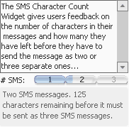
Give Sufficient Feedback: SMS character count
A custom SMS character count widget shows users exactly how many characters they have left before they need to send a message as two or more SMS messages. This is an especially important piece of information for users as they are charged for each SMS message sent.
Prevent Don't Scold: Form validations
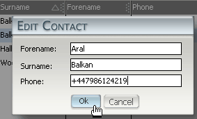
All forms implement client-side validation. Submit buttons (such as "Send Message" or "Add Contact") gray out until the form passes client-side validation. This does not remove the need for server-side validation and all form submissions are validated server-side for correctness and security before being processed. Client-side validation exists solely to improve the user experience and does not provide any security whatsoever.
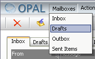
Let The User Work: Mailbox Tabs and Message Action Tabs
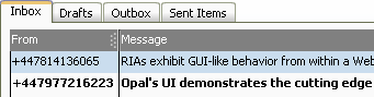 A composite tab-based interface exposes the critical, frequent tasks to users. Mailbox Tabs give users single-click access to their mailboxes. They also expose context-sensitive message actions for each mailbox. Users can immediately see the actions that they can perform on a message in a given mailbox tab.
Implementing a context-sensitive menu that hides possible actions until it is triggered would have ranked at the opposite end of the usability spectrum and been ignored by most new users.
Show, Don't Tell: Menu Bar and Tool Bar as teaching methods for migrating Outlook users.
 A menu bar and tool bar remind users of the ones in Outlook without creating operating system specific expectations.
The menu and tool bars implement Show, Don't Tell.
When an Outlook user first changes to a given mailbox using the menu or tool bar, the Mailbox tab animates to the chosen mail box, thereby showing the user that they could also have clicked on the tab (although the tab control is a well-known GUI component in its own right.) The same goes for when the user selects a Message Action (eg. Reply).
Don't Lose The User and Don't Sell What You Can't Deliver: Screen-based RIAs vs. Multiple-Window-based RIAs.
 It is very important to note the differences between Graphical User Interfaces (as used by desktop applications such as Outlook) and Web User Interfaces (as used by Rich Internet Applications such as Opal). It is equally important to manage client's expectations as to the limitations of Web User Interfaces, even those termed "Rich" and developed using Flash.
The greatest difference between a WUI and a GUI is usually the most overlooked: WUI applications run from within a GUI application which, in turn, runs inside a window-based operating system. Past usability studies have shown that especially beginning users have problems with the concept of multiple windows, preferring usually to keep a single window up at a time. Even in multitasking operating systems like Windows XP or OS X, novice users sometimes prefer to start up a single application, shut it down and start another application and so on. The perceived complexity of the system is heightened when the user is confronted with an interface (an RIA such as Opal) within a GUI application (the web browser) that itself contains windows.
Firstly, we rob our novice user of the comforts of his single window existence. Secondly, the new windowing system works in a different way and contains its own rules and limits. It is thus important to implement a screen-based interface in RIAs so that you Don't Lose The User and Don't Sell What You Can't Deliver.
Even if an RIA developer takes pains to develop a Multi-Window Interface that mimics a certain dominant OS, the interface is still being presented to the user in the document area of a GUI application (the web browser). This is contrary to OS expectations wherein users expect not to see windows within documents. Perhaps this is one area where application browsers such as Central will have an impact on user expectations. It remains, however, that the only way a multi-window interface can provide a high-level of usability in an RIA is if the application can run in its own OS window and not as a document within a web browser and thus access the windowing abilities of whatever OS it happens to be running on. As this is currently not a possibility with Flash, we decided to go with a screen-based system in the application.
Although modal pop-ups are sparingly used due to issues of screen real-estate and Outlook migration expectations, users are visually shown that these dialog boxes are modal screens via the graying out of lower screens. Although this removes the OS expectations surrounding non-modal multiple-window interfaces, the graphic similarity of the dialog screens to windows still leads certain users in testing to attempt to move windows around.
Don't Keep Them Waiting: The name of the game is performance.
If there was one issue we kept running into during development, it was performance. Flash is not the fastest kid on the block and it is possible to run into issues when client's expectations are not managed as to the limitations of RIAs. Although RIAs can recreate a lot of the desktop application experience from within a web application, there are limits.
Flash 9 and ActionScript 3 have made great strides in performance and it is important to keep in mind that this project was being published for the Flash 6 player.
 One issue, for example, was that the speed of the setSize() method on the Macromedia DRK Data Grid was resulting in unacceptable redraw times when the application was resized. This resulted in a very risky two-weeks in which I wrote a completely new Data Grid component that implemented the DRK Data Grid interface and could be plug-and-play replaced into application. The resulting Data Grid offered a 10x performance boost and brought redraw rates back within acceptable limits.
I hope that this article has challenged how you think about usability and accessibility and that you will find it to be a useful resource in designing and developing web applications. As always, I value your feedback so please feel free to leave a comment and share your thoughts.
Comments
by Scott Barnes on 2006-08-14 00:51:46
by sascha/hdrs on 2006-08-14 02:50:16
by LEE on 2006-08-14 05:32:56
by aral on 2006-08-14 14:43:57
by dietlev on 2006-08-15 08:59:02
by Riability » Blog Archive » Designer une Interface Utilisateur : Principes de base on 2006-08-15 11:30:13
by aral on 2006-08-15 11:38:24
by dietlev on 2006-08-15 12:16:54
by Fred on 2006-08-15 16:43:49
by aral on 2006-08-16 12:43:06
by Justin’s Blog - Cool read on UI on 2006-08-17 13:39:16
by nowuseit.com | links for 2006-08-17 on 2006-08-22 08:18:57
by niqui merret » Blog Archive » Visit with the RNIB (Royal National Institute for the Blind) on 2006-08-23 15:35:10
by A visit to the RNIB at Aral Balkan on 2006-08-25 16:35:12
by Best practices for client-side validation in Flex 2 at Aral Balkan on 2006-08-30 15:08:56
by Web X.Y - The importance of usability testing on 2006-09-21 08:25:09
by Conferences: necessary? at Aral Balkan on 2006-09-24 13:09:52
by ui friend on 2006-09-24 18:12:15
by User interface design principles for Web Application at Web 2.0 Log on 2006-10-06 22:35:20
by World Usability Day; Usability and Flash at Aral Balkan on 2006-11-14 13:44:22
by andrew lloyd :: creative design » Blog Archive » FotB Day 1 on 2006-12-07 16:17:38
by class.digitalartwork.net | vico473 » Blog Archive » User Interface Design Principles for Web Applications on 2007-01-08 18:51:34
by RexyStudios » Best Practices for client-side validation in Flex 2 on 2007-02-14 18:21:01
by Plaigarizing blog posts is stupid at Aral Balkan on 2007-02-15 11:58:16
by Aral Balkan’s User Interface Design Principles for Web Apps « noah little on 2007-02-26 13:10:31
by Pauline McNamara @ NTE » Blog Archive » Aral Balkan’s User Interface Design Principles for Web Apps on 2007-02-26 13:14:00
by Vox on 2007-02-26 18:29:11
by al libke on 2007-03-01 19:50:53
by Edutech NTE Podcast » Blog Archive » Most IT Projects Fail? Aral Balkan’s Memo to the CEO on 2007-04-26 14:55:31
by p1uton » Принципы дизайна пользовательского интерфейса web-приложений on 2007-05-07 12:52:15
by Sherif Mansour on 2007-05-11 02:54:56
by The Nitty Gritty | Flash Blog » Adobe Live! 2007 In retrospect on 2007-05-30 18:22:30
by Blog of Web-PM » Blog Archive » UI Design Principles on 2007-08-03 08:02:45
by Wordpress QuickStart Guy on 2007-08-15 12:11:06
by Блог про юзабилити и дизайн интерфейсов » Принципы дизайна пользовательского интерфейса web-приложений on 2007-08-25 04:49:40
by Bob Warfield on 2007-08-29 15:42:05
by JOrge on 2007-09-22 17:13:59
by Aral Balkan’s User Interface Design Principles for Web Apps « noah little on 2007-10-08 11:16:26
by Hasan Civelek on 2007-10-09 10:09:15
by raj verma on 2008-08-22 09:56:57
by Sean on 2008-05-25 20:13:24
by Web应用软件的界面设计相关网页 | Since 1980 on 2008-12-04 01:53:24
by DIseño web on 2008-02-04 09:07:17
by Farid Abdulhadi on 2008-06-26 22:26:35
by Raghu M on 2008-02-07 10:28:31
by Brock Noland on 2008-03-11 01:15:57
by Naresh Kalose on 2008-03-13 11:02:16
by marco on 2008-03-29 02:29:06
by prasad on 2008-06-19 09:17:19
by jeeva on 2008-10-10 09:45:08
by jeeva on 2008-10-10 09:46:40
by EmmaPeterson on 2009-01-30 07:25:10
by Юлиан on 2009-01-28 10:06:02
by Brandy on 2009-02-18 21:18:36
by judz on 2010-07-09 06:11:06
by Goletas on 2010-11-26 20:21:53
by Kevin Meyer on 2010-07-31 20:30:33
by ibiza on 2010-10-05 17:52:59
by Paul on 2010-09-08 11:59:27
by Nuriel on 2010-10-21 07:41:52
by ugg boots on 2010-12-14 03:25:48
by Yates on 2011-01-11 10:47:34
by aasdsdf sdfsdfsdf on 2011-11-11 16:55:47
by Week 3 | nico900 on 2011-12-21 22:33:47